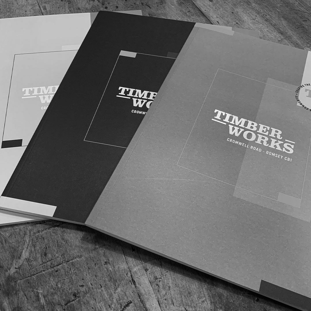
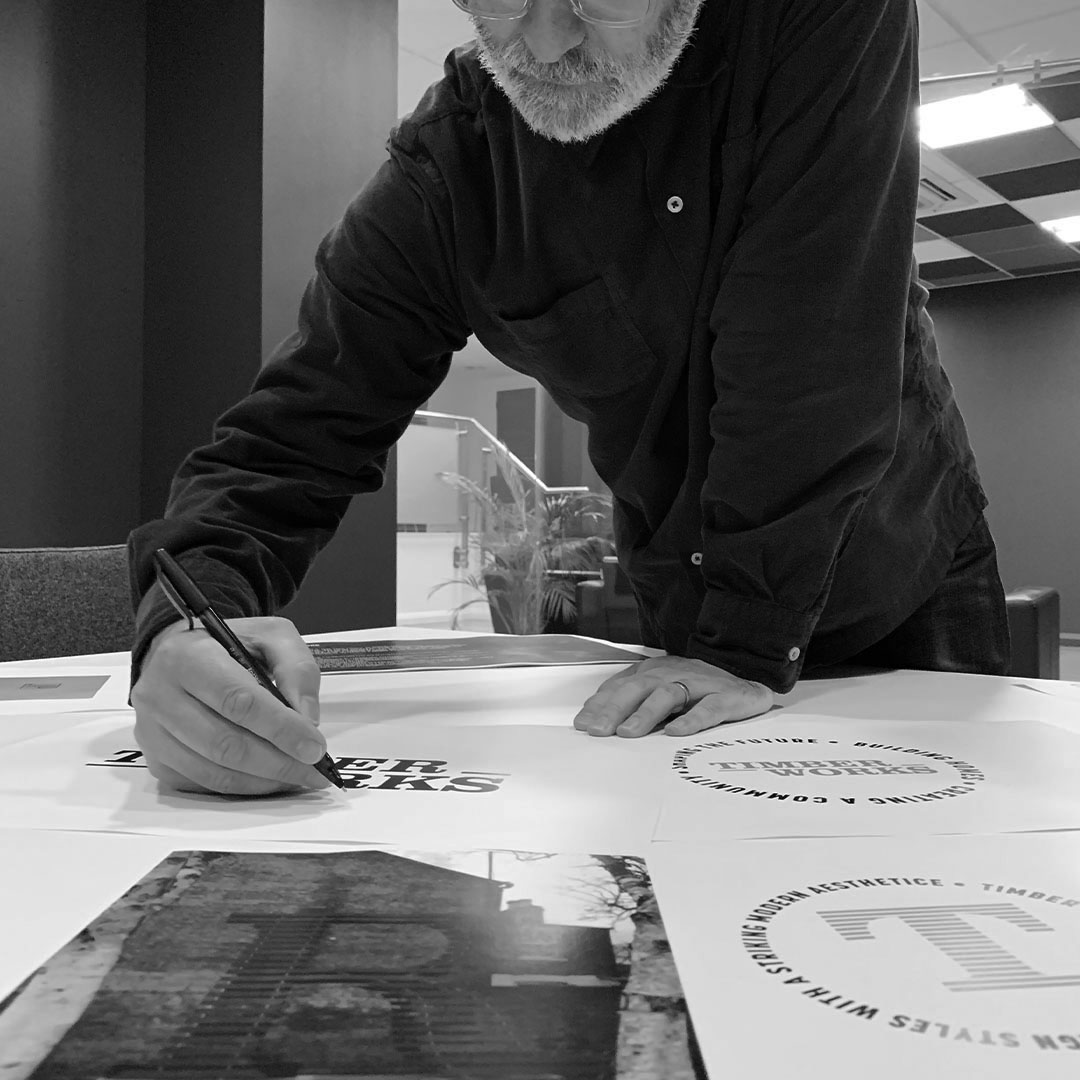
DS.Emotion were asked to develop the creative look and feel for Hill’s new residential scheme in Cambridge following the successful completion of the Ironworks project. Hill wanted a brand and identity for the scheme that felt like a sister development to Ironworks but that would also stand alone and have its own unique identity and personality. Dan Bedford – DS.Emotion’s Creative Director provides a little insight on the process…“At the start of any project we’re usually asked to help with the naming of the scheme. With the site being a former timber yard it seemed an obvious and authentic route to explore and a great way of connecting this new development to its sister development. Following a consultation process Timber Works was selected as the name.We presented a variety of logo designs, initially that played on the ‘timber’ theme and some that had a more historical feel, as well as a selection that were inspired by the character of the surrounding area of Romsey. Our team went through the usual process of tweaking the details, size and shape until we arrived at the chosen logo – A simple, type led identity, inspired by the Romsey ‘R’ sculpture that sits close to Timber Works on Mill Road.We selected a colour palette that would be sympathetic to the schemes history and heritage with muted greens and pale blues, alongside a bold mustard and deep blue. These colours form an integral part of the creative ‘look and feel’ for the campaign and feature across all the marketing, from brochures to press ads, digital collateral and site hoardings, down to the paint and furnishings used in the sales office.Timber Works as been a great project to work on with Hill and it’s extremely satisfying to see the creative in the public domain after all the collective hard work”.


