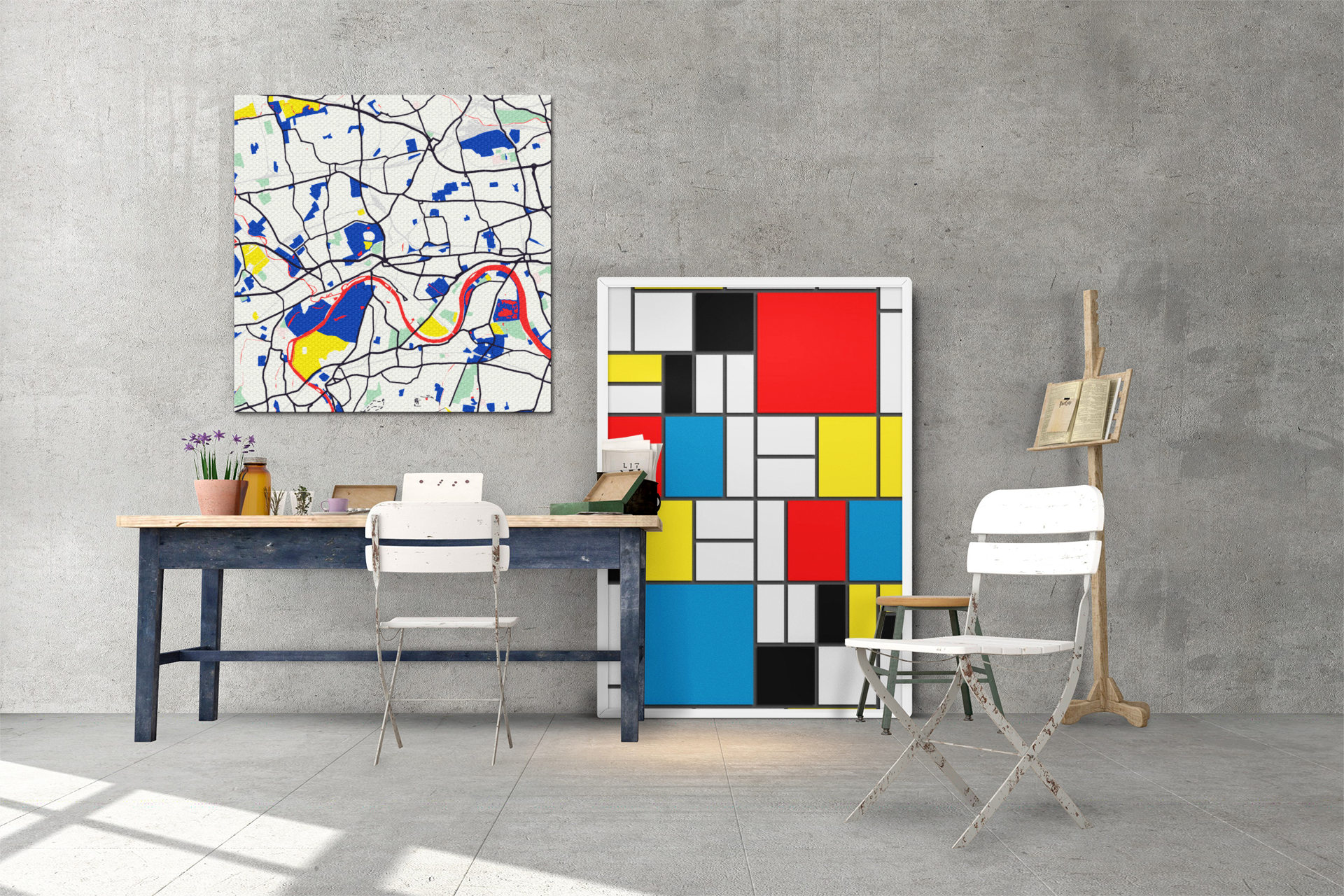
Custom map styles offer users the ability to personalize their Google Maps. By adjusting colours, labels, and icons, users can create visually appealing maps that align with their preferences or brand identity. Customization transforms Google Maps into a unique tool that enhances the overall map experience, allowing for brand expression and improved visual impact.
Here are some of our favourite styles:
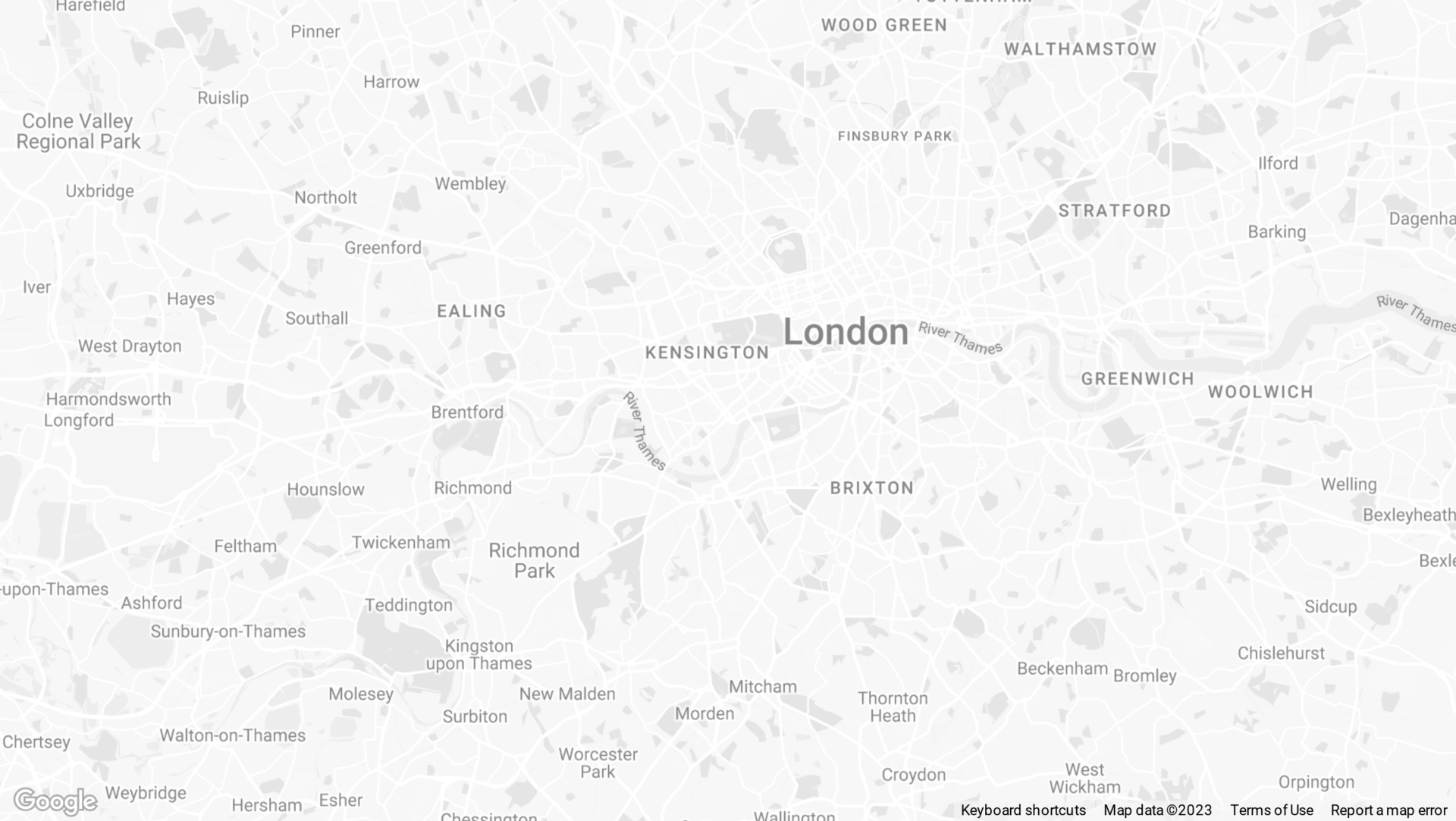
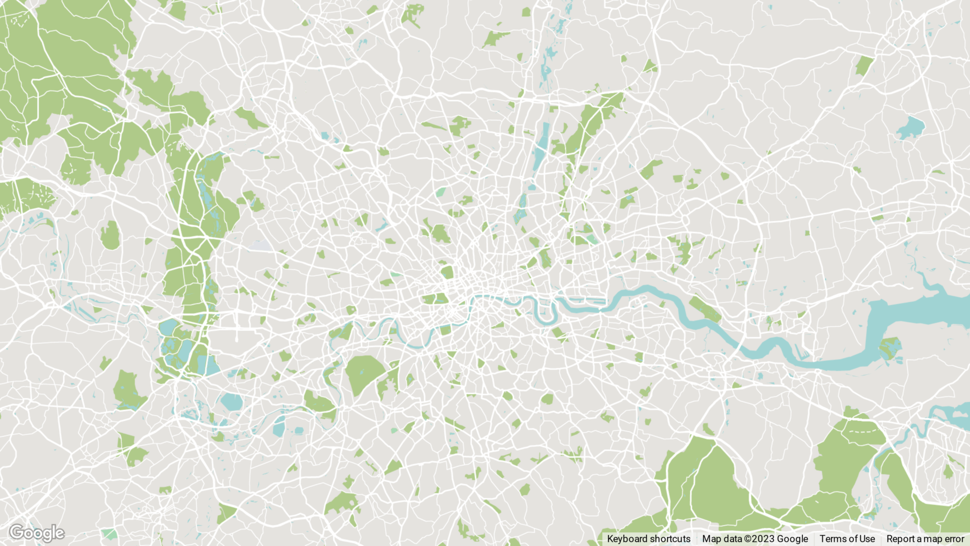
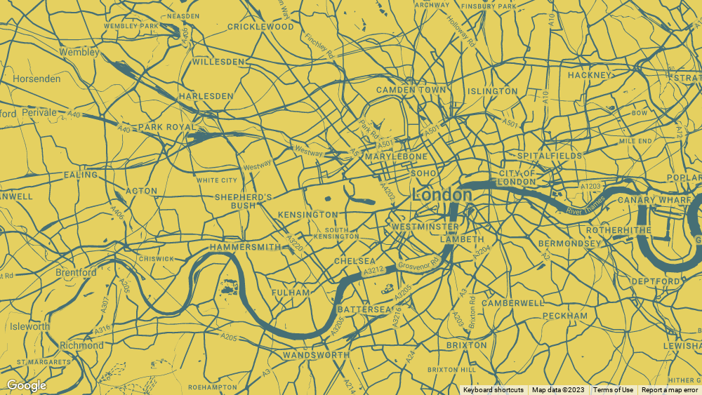
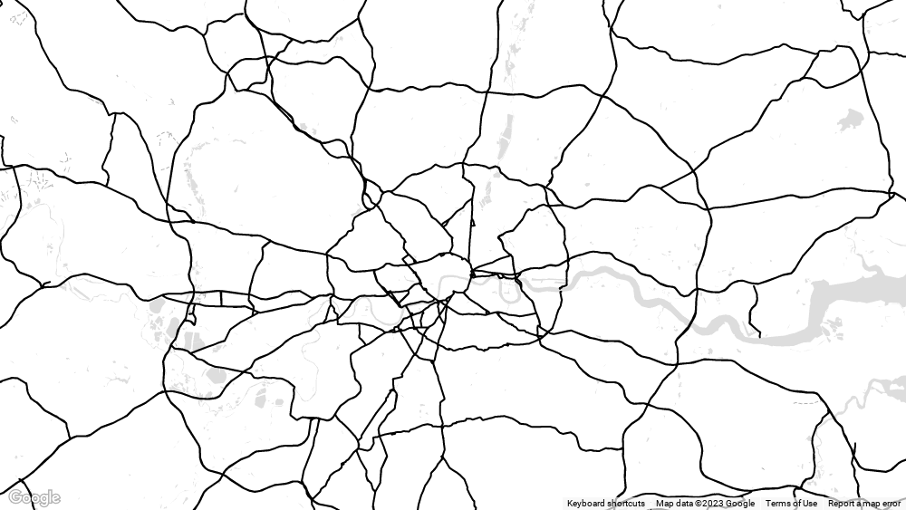
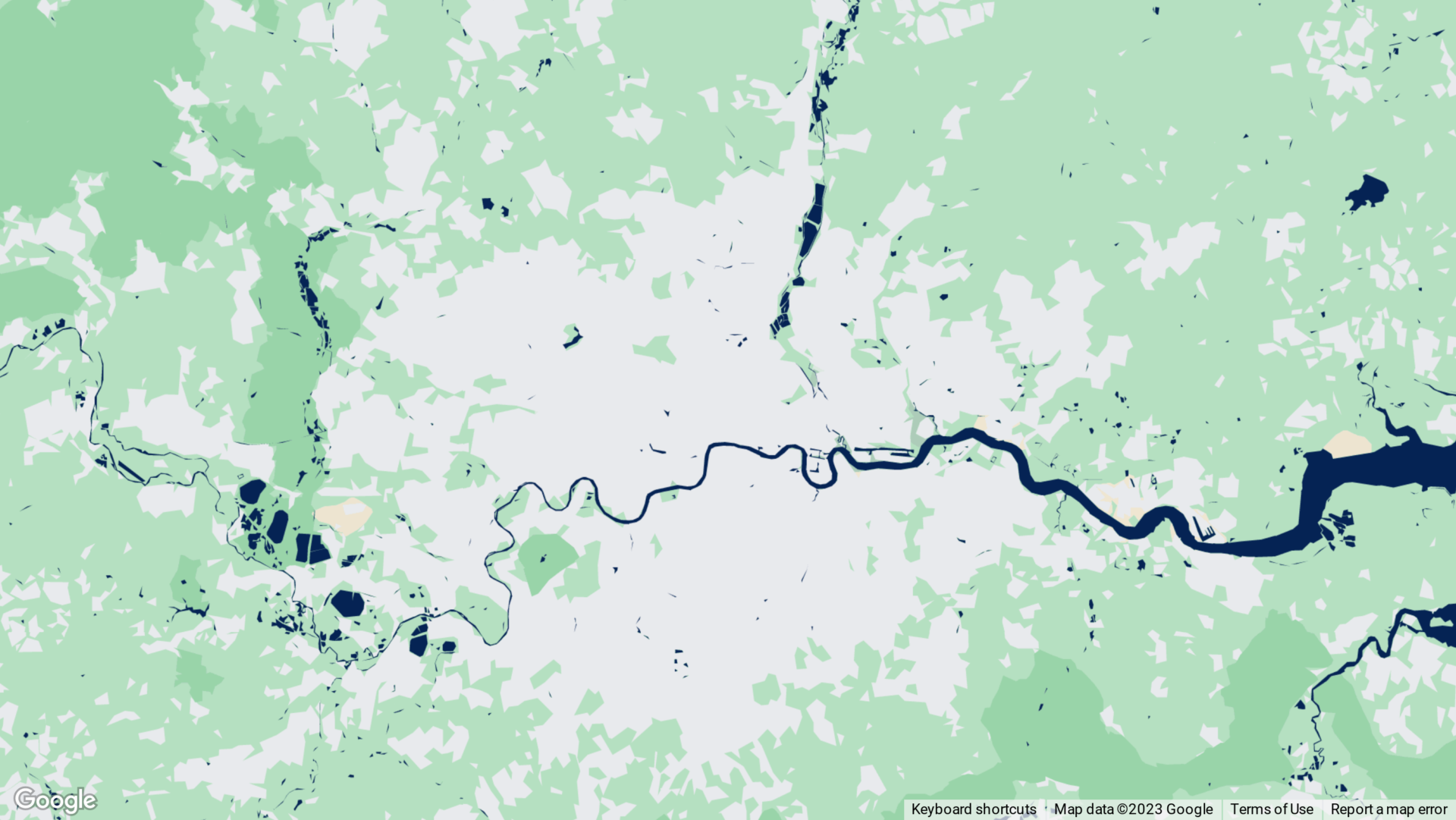
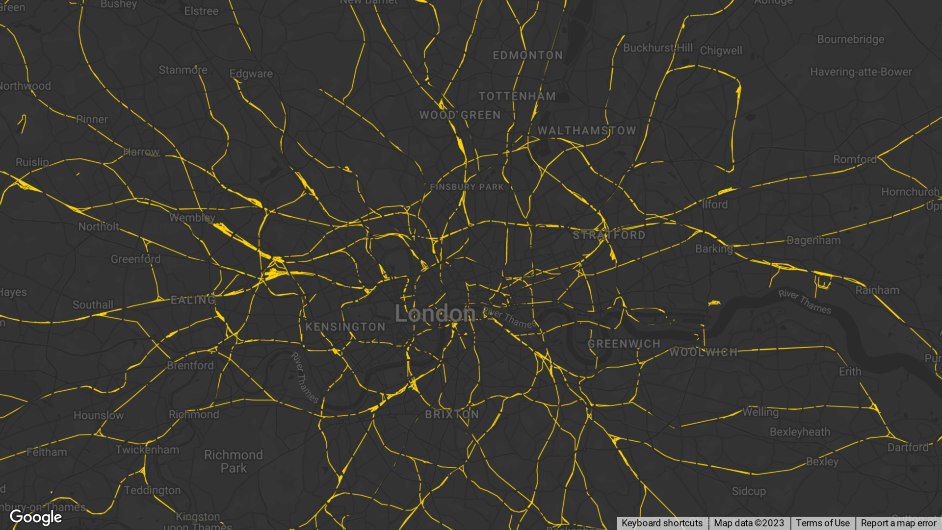
Dynamic Maps
What’s good is that they are dynamic. That means, by using a style, we can have live maps that look great. See this simple example below. It’s an on-brand map, with useful features (like pop ups) but most importantly it uses live and up to date Google Maps so people can zoom in and out to find the references points that matter to them.
This is our standard for new websites.
We think these look pretty good. They are on-brand, visually appealing and use the latest data from the most popular maps platform. So, when we say these are standard, we don’t mean these are basic. This is our out of the box multi-pin map. So, if you’re talking to us (or anyone else) about maps on your website, this is a helpful example. This is what we mean when we say a map.
Of course, like most things, we can add features and create custom content. However, custom features always costs more than the standard.
So, it’s worth asking if spending more on that map will drive results or if that extra budget could be used elsewhere (like better photos, great copy writing or PPC).
_
Small Print
We didn’t actually talk about APIs. Being honest; most people aren’t that interested. These are the connections to Google Maps that make it possible for our developers to style and include maps on a WordPress website without having to build it all from scratch. This means that we spend clients budget on style, content and user-experience instead of wrangling a spreadsheet of co-ordinates. But, if you’re interested in finding out more; here’s a guide to Google’s Map Platform.