Picture the scene: you’re browsing the web while on the move, scrolling on your mobile when you come across an image that hasn’t been optimised…
It’s either takes over your whole screen, takes ages to load (and sucks up a load of your data while it’s at it) or is so small and scrawny you just can’t read it. Whatever the case, if an image hasn’t been optimised for specific device use, it’ll turn a user off.
Let’s play a game of spot the difference…
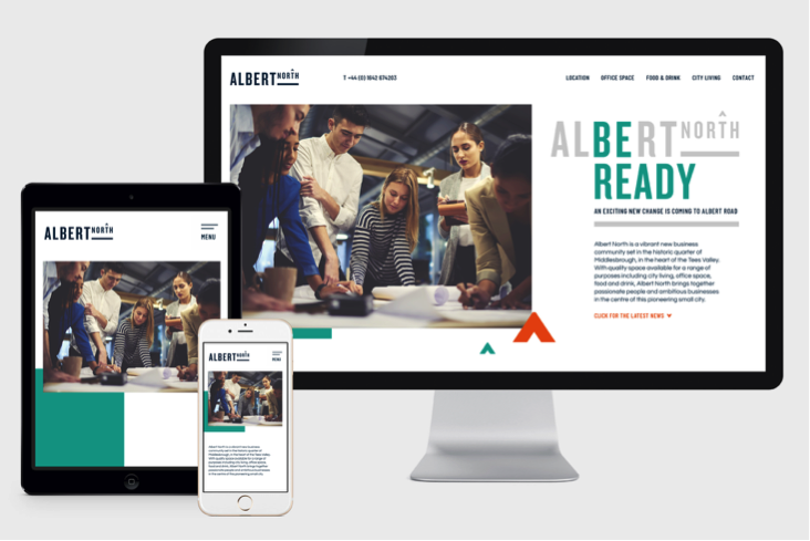

As you can see from the second example, where the size aspect ratio has been optimised, the image is much more vibrant across all devices (and will also take less time to load).
A lot of our web work contains stunning imagery to wow consumers, so we always think about how a user will experience and interact with our sites.
People access websites across different devices. Though traditionally people would consume the majority of content on desktops and laptops, people now have access to sites across an array of devices such as games consoles and, of course, mobile phones. Stats show mobile devices account for 52% of web traffic. Other devices such as game consoles are up 17% on last year, which shows promising signs of future growth. Web developers need to be particularly mindful of these trends, particularly when it comes to how users access websites on their phones. For example, uploading huge images onto websites can be troublesome and affect a user’s mobile data.
How the magic happens
So how do we ensure our users get a tip-top experience, no matter what device they’re using?
Using Zurb’s Foundation Framework, we can use a powerful feature called ‘Interchange’ that allows us to render images of various sizes for different screen sizes. This means users viewing a website on a desktop computer can view the higher res version, while mobile users will see an optimised, data-friendly version.
<img data-interchange="[assets/img/interchange/small.jpg, small], [assets/img/interchange/medium.jpg, medium], [assets/img/interchange/large.jpg, large]">
Foundation has media break points to allow you to set to different sizes (small, medium, large, x-large), which will then change the image depending on your screen size. This will also work for background images.
<div data-interchange="[assets/img/interchange/small.jpg, small], [assets/img/interchange/medium.jpg, medium], [assets/img/interchange/large.jpg, large]"></div>
Don’t try this at home!
Okay. Maybe you can, just this once. This feature can also be used with WordPress by adding a custom field, using code such as the below:
$intro_image = get_field('intro_image’);
<div data-interchange="[<?php echo $intro_image['sizes']['sq-small'];?>, small], [<?php echo $intro_image['sizes']['sq-medium'];?>, medium], [<?php echo $intro_image['sizes']['sq-large'];?>, large], [<?php echo $intro_image['sizes']['sq-xlarge'];?>, xlarge]"></div>
The end result
Using this solution to serve responsive images across different devices provides a smooth user experience, whether the consumer is browsing on their mobile or a desktop. For our clients, their impressive photography remains impressive across all devices – wooing their customers every time.
Our team creates stunning websites that beautifully compliment our clients’ marketing collateral. View our case studies on Instagram and get in touch if you’d like to chat to the team about your next project.